For my final blog post, I wanted to write my own personal review of the course and what I gained from the last fifteen weeks. This was my last semester of undergrad, so I really wanted to take everything I could from the courses I was enrolled in. I was truly excited about taking a course that revolved around graphic design because it is such a massive part of almost every career field. I, for one, am hoping to continue working within graphic design and maybe even do some freelance work if permitted.
I feel that I learned so many different techniques throughout the semester. I have much more confidence when it comes to design pieces. I feel that I have gained the knowledge of what images work, what fonts should be used in certain areas, and what colors are the best choice. Every project we were assigned allowed us try our hand at something new. If someone asked me to name my absolute favorite assignment of the semester, I would struggle to pick just one.
The initials project was a great way to get our feet wet. We could try different things without worrying about a grade and just have some fun before really getting into the complicated art of design. The magazine layout forced us to work with a designated theme and find a way to make the story interesting and attractive. The instant book could be anything we wanted. We could make it personal, comical, emotional, simple, abstract, and complicated—as long as it was in black and white. A small limitation that pushed us to use things besides color to tell a story. The poster pushed us to stand up for a social issue that we believe in fighting for. Words, images, color, there was no limit, so long as it had a concrete meaning. And lastly, the brochure brought in the marketing side of design. We were creating a piece that was meant to sell and educate our viewers on a specific person, location, organization, and so on.
I am truly grateful for this course and what it has taught me. It opened up a new door for me, and I really hope that I can continue to progress within the art of graphic design. I developed a real passion for it and will be forever proud of the work I produced. Thanks for a great semester, Professor Greenan!
Wednesday, December 12, 2012
Importance of Font, Color, and Image.
There are many important factors that give a graphic design piece it's identity, but there are three elements that I feel top the list.
Font.
Color.
Image.
The font that a graphic design artist selects acts as medium for delivering the words on the page in a certain manner. A commonly used font, such as helvetica, gives off a more professional, simple, and clean-cut vibe. A script font is sometimes harder to read, but does add a bit of a fancy and classic air. A serif font can be used to look more traditional, like the fonts used in older books.
The color that an artist incorporates into their work has the ability to bring a specific emotion to the viewer. A deep shade of blue can cause the piece to feel melancholy and depressed. A lighter shade could bring a sense of calm. A bright yellow or red is bold and hard to ignore. A black and white color scheme allows the viewer to focus on the content rather than be distracted.
The images that are selected can bring the work to life. They can put a face with the words being said. They can cause the audience to associate a single image with the message. They can enhance the message. Images aren't necessary vital to every single design, but when you used, they can bring a sense of reality to a design.
Brochure Critique
Our final day of class was this past Monday, where we spent some time passing around each of our completed brochures. I honestly can't say that there was one I didn't like or find creative. I was extremely pleased with the response that my brochure received. People mentioned that it seemed professional and well balanced, while Professor Green commented on my ability to select fonts that mesh well. I was genuinely happy with the response because this piece was a bit more fun for me to work on, rather than the heavily emotional project I've done most of the semester.
As mentioned in a previous post, my brochure's purpose was to promote and educate everyone on one of my favorite musicians, Ed Sheeran. The color scheme I used was a mixture of orange, black, and white. I was apprehensive about using orange as a main color, but I felt it was necessary since Ed is indeed a ginger and uses the color quite often!
SIDE ONE:
 SIDE TWO:
 I wanted each page to serve a specific purpose and have it's own identity, but without straying too far that it seemed completely random and out of place. Also, for picture selection, the three images that I chose to use helped give the page more if it's identity. For instance, on the biography page, we have a more quirky photograph of Ed. The tour page features an image of him performing. And the social media page has a picture of him with a piece of paper saying "HI!" on his tongue.
If anyone is wondering why there is an orange paw-print on the front page, it's because Ed has made that paw-print on of his signature logos, along with a plus sign. Staying on the topic of the front page, I didn't include any images because I wanted to emphasis the fact that Ed Sheeran is a very music first artist. He is actually quite awkward in interviews and would much rather let his music do the talking.
I would love to get some more feedback on my brochure! Some of my friends suggested that I actually mail the brochure to Ed's management team! Haha :)
As mentioned in a previous post, my brochure's purpose was to promote and educate everyone on one of my favorite musicians, Ed Sheeran. The color scheme I used was a mixture of orange, black, and white. I was apprehensive about using orange as a main color, but I felt it was necessary since Ed is indeed a ginger and uses the color quite often!
SIDE ONE:


If anyone is wondering why there is an orange paw-print on the front page, it's because Ed has made that paw-print on of his signature logos, along with a plus sign. Staying on the topic of the front page, I didn't include any images because I wanted to emphasis the fact that Ed Sheeran is a very music first artist. He is actually quite awkward in interviews and would much rather let his music do the talking.
I would love to get some more feedback on my brochure! Some of my friends suggested that I actually mail the brochure to Ed's management team! Haha :)
Tuesday, December 4, 2012
Nikolay Saveliev
I'm dedicating this blog post to an up-and-coming graphic design artist, Nikolay Saveliev, whom I discovered while reading Print Magazine's 20 Best Graph Artists Under 30. Saveliev, who is originally from St. Petersburg, Russia, studied at the Rhode Island School of Design. While still studying, Saveliev left for NYC, where he tried his hand at go-go dancing. After realizing that it wasn't one of his best decisions, he returned to school to complete his degree before trying the NYC scene one more time.

Through the variety of branding jobs he worked, Nikolay developed his own style of illustrations where he could create his own worlds. Eventually, he gained attention through his designs via freelance and personal projects. Saveliev says that he is influenced by 80's New Wave Music and even religion, even though he isn't particularly religious from a personal standpoint.
"I like the higher-up mysticism," he says, "which is a lot like design, a lot like art--it's trying to communicate something that's not tangible until you create it." (credit to printmag.com)
Here's one of Saveliev's featured works on printmag.com:

Brochure Options
For our final project, we have been asked to design a tri-fold brochure that can focused on practically anything we so choose! When I first approached the project, I was torn between doing a brochure on the lovely city of London, or a brochure about myself to be used as a resume piece. As I debated between the two ideas, I was listening to one of my favorite artists, Ed Sheeran, a fairly unknown British singer songwriter. It was then that I decided I wanted to dedicate the brochure to him!
At that point, the music geek in me was pretty darn excited to work on a whole project that was devoted to a great musician. I figured that the brochure could include things such as a short biography, discography, upcoming tour dates, and so on!
As of right now, the brochure is looking good. I have two more pages to complete before I can call it a day. I tried my best to make the brochure truly reflect Ed through the symbols, images, and colors that I selected. For instance, Ed is known for his ginger hair, so he tends to emphasis that by using orange as a major color when it comes to his album cover, merchandise, and promotional material. So, it's safe to say that one of the three colors I'm incorporating into my brochure is indeed orange!
The biggest obstacle I've faced during the process has been finding a way to fit in all of the information without crowding the pages or cutting of any words. Luckily, with some sizing adjustments it's coming together.
Can't wait for it to be completed! Only two more classes left, then we're done for the semester. CRAZY.
Mental Illness Awareness Poster
As I mentioned in my previous post, I created two social awareness posters because I was having difficulty deciding between my two ideas. For the poster that I selected to submit for grading and critique, I focused on the awareness of mental illnesses.

Approximately a month before my dad passed away from cancer, I was professionally diagnosed with severe depression. Throughout the next three to four years I struggled with daily tasks because I had very little want to do much besides hide in bed and listen to music. It got to the point that my part-time job was suffering because I would call in more than half the time and I had to withdrawal from multiple courses during multiple semesters. During these struggles, I was supported by amazing and loving people, however, I did encounter a few individuals who felt my depression was something I could fix with positive thinking or maybe even the flick of a switch. It wasn't until last summer that I was able to come off of anti-depressants, and yet I still have moments where I find myself stuck in similar place as before.
Here's my poster:

For my slogan/tag line, I wanted to use something that was direct and firm, without being rude. I feel that "IT'S REAL. Even if you can't see it." describes precisely the message I wanted to get across. Although mental illnesses can't be seen from the outside, they are very serious in nature and do have a profound effect on a person's well-being. I used two different fonts, one that was serif and one the was helvetica light. As for the color scheme, I consciously choose to use blue because it is so commonly associated with sadness, melancholy, and depression.
Feedback and comments are welcome :)
Saturday, November 24, 2012
Women's Rights
As I mentioned previously, I was considering creating a poster based on the need for people to acknowledge women's rights. Well, I ended up creating two posters! One for mental illness awareness, AND one for women's rights. Since we can technically only bring one to the critique, I decided to just share the women's rights poster on here.
Here's a quick excerpt from the article she linked us to:


I found this extremely disgusting and upsetting. The fact that a grown man feels that manhood is being threatened by the way women are being portrayed in films is almost laughable. However, instead of using this blog entry to rant, I'll let my poster design do the talking for me.
Here's my poster:

I wanted the message to be direct and show just how important and powerful a woman is in this world. The woman's silhouette was what I had envisioned from the beginning. The idea of having a strong female taking up most of the poster helped the message take on a life of its own, in my opinion. As for the text, I wanted it to be simple, but bold and firm. "MY BODY. MY CHOICE." Says it all really! I needed the color scheme to have a bold color, so I figured a deep crimson was a good fit. I honestly feel that colors like red, black, and white have the ability to be clean, yet give a piece some emotion.
I'll be sharing my second poster later this week! Thanks for reading and checking out my blog. :) Any thoughts or comments are welcome, as usual.
Sunday, November 18, 2012
Album Cover Art and Film Credits
This past Thursday, I went to see Breaking Dawn: Part 2 with a group of friends. Yes, it's possibly one of the worst teen book series, but it's a guilty please of mine. As the film started, I realized just how much my perspective and senses have been effected since taking this course. I was immediately mesmerized by the opening titles and the design. Unfortunately, I don't have any images to share since the film just premiered this weekend, but I can honestly say it was pretty fantastic. As they displayed each actor's name, the screen flipped between three color filters, red, black, and white. The images they were layered over were of snow-covered mountains, deep valleys, and rivers. Something so simple was already giving me chills!
After experiencing that excitement, I decided to share a few other designs that stem from album cover art to again, opening film credits.
First up is British singer/songwriter Ed Sheeran and the cover art for his most recent album, "+".
 It is a very simple concept. Ed's face. Ed's name. A plus symbol. And a paw-print. Each of these things reflect that artist. All of these details may seem minor, but they are now the basis for anything that Ed releases or designs. Ed, who is a ginger, has always been very enthusiastic about the color orange and paw-prints. The font has become his "go-to" font for clothing, tour buses, stage backdrops, and so on. I think I enjoy this album cover so much because it embodies everything that is Ed Sheeran without the actual music.
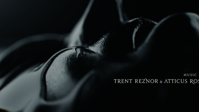
Second up is the opening credits for the 2011 film, The Girl With The Dragon Tattoo.
 I read the series prior to seeing the film, so I was absolutely pumped to see the film! If any of you have read the books, you know that they are all fairly dark and twisted. The opening titles reflect the books by using footage/images of people cover in a black liquid with a black backdrop and a simple light filtering through. As you can see in the picture above, they selected a font that adds to the creepy and eerie feeling that surrounds the movie.
Just a few things that I wanted to share with all of you! Any album covers or film designs that you admire?
After experiencing that excitement, I decided to share a few other designs that stem from album cover art to again, opening film credits.
First up is British singer/songwriter Ed Sheeran and the cover art for his most recent album, "+".

Second up is the opening credits for the 2011 film, The Girl With The Dragon Tattoo.
Just a few things that I wanted to share with all of you! Any album covers or film designs that you admire?
Monday, November 12, 2012
Poster Ideas
For our next class project, we have been asked to create a poster that addresses a social/humanistic problem that means something to us. I was instantly excited for this project because I've always loved showing support and bringing attention to issues that truly resonate with me. Unfortunately, I'm currently struggling with deciding between two separate ideas.
Since the election just ended a week ago, I'm still buzzing from everything that has been described as a "hot topic" over the past five or six months. I'm very open with the fact that I am indeed in support of women's' rights and gay rights. Being a woman, I feel that we are all individuals and should have control over our bodies, whether it be the right to have an abortion, not to have an abortion, receive contraception through our work's insurance, or define the different "levels" of rape, it is our right. As for gay rights, I've always believed wholeheartedly that everyone should have the same rights no matter who you're in love with. Love is love. One of my coworkers is openly gay and I can not image missing his wedding solely because the state tells him his marriage shouldn't count.
So, now that my rant is over, I'm between the possibilities of having a poster that reads "My Body. My Choice." for women or even being a bit more rash and saying "My Uterus. My Choice." or a poster supporting gay rights that reads, "Love Is Equal."
Does anyone have any suggestions?
And just to make sure I'm not offending anyone, I want to say that I respect all of your opinions in regards to these subjects. These are my opinions, I am not forcing them on any of you. Please understand that.
Completed: Instant Book
Last Wednesday was our critique for the instant book project. As I previously wrote in another post, my book was pretty personal, so I was a bit nervous about sharing it with the class. I've always loved expressing myself through poems, song lyrics, and writing in general, so I was excited for the class to read one of my little poems. I was definitely pleased with my final project because I felt as though the images I incorporated brought the poem to life.
Professor Greenan mentioned the fact that images almost took us away to Paris and made it seem as though this story was happening elsewhere. She also commented on the fact that I wrote the story in third person. To be honest, it happened quite subconsciously and as I look back, I think I wanted to tell the story as though everything that I was talking about had happened to another girl and not necessarily to me. One of the main themes of the book was also the importance of numbers. I know for a fact that I will never forget the time that my Dad passed, his age, my age at the time, or the date. Those numbers are burned in my brain and I think that by emphasizing them, I was able to make the readers realize just how much losing someone can impact your existence.
Here's how my book turned out:
 *There is spelling mistake (clock), but I did correct this before the final printing.
Here's the inside poster:

Professor Greenan mentioned the fact that images almost took us away to Paris and made it seem as though this story was happening elsewhere. She also commented on the fact that I wrote the story in third person. To be honest, it happened quite subconsciously and as I look back, I think I wanted to tell the story as though everything that I was talking about had happened to another girl and not necessarily to me. One of the main themes of the book was also the importance of numbers. I know for a fact that I will never forget the time that my Dad passed, his age, my age at the time, or the date. Those numbers are burned in my brain and I think that by emphasizing them, I was able to make the readers realize just how much losing someone can impact your existence.
Here's how my book turned out:

Here's the inside poster:

I wanted the font that I used to tell the story/poem to look handwritten and give the reader the sense that they were maybe even reading a personal letter or journal. Everything from the photographs to the text is original, except for the final quote on the inside poster. I wanted to include that specific quote because it describes my Dad and the fact that he never told me what to do with my life or how to carry myself, he merely set an example and I learned from that.
Any thoughts or comments are more than welcome! Thanks for checking this out. :)
I would also like to dedicate this post to my Dad. Thank you for being such an amazing person and teaching me to love who I am and never give up on any dream no matter how massive it may seem. You were the best and I hope to make you proud. I love you, dearly.
Monday, November 5, 2012
Importance of Color
I'm noticing more so now with the election right around the corner, that news shows feel very strongly about the colors they use to design their sets and graphics.
I'm currently watching the Rachel Maddow Show on MSNBC, which airs at 9pm ET, and is a political opinion/current news program. I usually tend to watch CNN, but over the last few months I discovered Maddow and really got hooked on her interviews and commentary. Until now, I hadn't realized just how american pride her set and graphics were!
The studio is adorned in all red, white, and blue. The graphics that appear when the show turns to a commercial are red, white, and blue. The headline designs, the poll graphics, the news ticker, and even the cup on her desk, are all RED, WHITE, and BLUE.
Coincidence? I'm thinking not.
Rachel Maddow, whom I would consider to be a liberal individual, is pretty aware of the importance of displaying the fact that her program is meant to bring serious and vital information to the American public. No matter her political positions, we automatically associate the program with the country and the governmental aspect. Who knows if Rachel is even that massively proud of being an American, but her program's design seems to speak volumes. Could the point of all the american pride color schemes be to attract "channel flippers," who might otherwise mistaken the program as something more boring and lackluster?
Here's a promotional graphic for The Rachel Maddow Show.
Thoughts?
Instant Book Update!
Today I officially completely my instant book. It differs in a few ways from the draft I created last week, but I'm pleased with those changes that came along as I designed it. Instead of including hand drawings, I opted to select some photographs I took recently and not so recently.
Two of the pictures I included are images I captured on my trip to Europe back in the summer of 2010. I went overseas for two weeks and spent time in London, Paris and Rome. Needless to say, it was amazing and I would love to go back in the future. Who knows, maybe even live there for some time.
Anyway, the pictures gave the book a more "dressed up" feel, in my opinion, but with the fonts I selected, you can still tell that the book is meant to be personal. I honestly love that we had to do this in gray scale. It challenged me at times. At one point I was designing the cover and thought that only using black, white, and RED, would be a great look for my book, unfortunately, red is not black or white. Whoops.
I'm honestly a bit nervous about the critique on this project because I took a few chances and decided to be slightly less conservative with my design, but I'm truly happy with it. Fingers crossed that it's well received!
I'll be photocopying the final product tomorrow, then spending some time folding for Wednesday!
Look for my final product sometime on Wednesday or Thursday evening. Can't wait for everyone to see it!
Monday, October 22, 2012
Book Theme
Ever since Professor Greenan introduced the class to project two, I've been mapping it out in my head. I almost immediately knew I wanted my book to revolve around losing my dad to cancer three years ago. Losing him was one of the hardest things I've ever gone through, but it also made me a better person. I experienced severe depression, which caused me to fall behind in school, ruin a few relationships, and even turn to self harm and an eating disorder. When I look back, it's almost as though I didn't even live for those few years, I merely existed.
It wasn't until March of this year that I actually felt like myself again and was able to discontinue using anti-depressants. As of now, I have a truly good quality life. I have become an even better version of myself and that's due in part to my dad and what he has inspired me to do and be.
The book will surround the idea that time isn't always on our side and we should never hesitate to say things like "I love you" to the people that mean the most to us. Today in class I began writing a poem that will act as the text of the book and I will start sketching out the images tonight or tomorrow.
Here's a quick sneak peak of the first stanza of the poem:
The world froze at 7:18.
The tick tock of the clock stopped,
Just as his breathing.
He was 59 the day that he died.
Thoughts?
Using FedEx to Print
I wanted to share my experience using FedEx Online Printing
to print my magazine layout for the in class presentations last week. A few
classmates faced some obstacles when it came to printing their final designs,
so I’m hoping this will give them a little guidance.
Once my project was completed and in PDF form, I accessed
the FedEx site and navigated to their online printing page, which can be found
here: http://www.fedex.com/us/office/index.html
I then clicked the “start online order” option and proceeded
with the “set up a document” option that allows you to upload files to the site
directly from your computer. Once uploaded, you can set the print options for
your document. I would recommend selecting the “set your own options,”
considering the fact that our projects need to be within a certain set of
guidelines. By setting your own options, you can select the type of paper,
print color and much more. The best part of this option is the fact that you
can add in special instructions that will be sent directly to the person
printing your document. When ordering my magazine layout, I made sure to
reiterate the fact that it was indeed an 11.5 x 17 document and I also wanted
it mounted onto a foam board.
Once you have done that, you can then entire in your
information and select which FedEx you would like to have your document sent
to. I selected the FedEx Kinko’s on McKinley Parkway in Blasdell, NY. If you did indeed include special
instructions, you will receive a phone call a few hours after placing your
order from a worker, who will go over your order before they finalize and print
it.
When I went to pick it up, the worker was extremely kind and
allowed me to look over the layout before I paid. In total, the layout cost me
around $8.
I hope this long and in-depth explanation will help some of
you the next time we have to print a project out for this class!
Best of luck!
Trouble With Exercises
I decided to dedicate this blog post to the exercises we have to complete on a weekly basis. I want to share my struggles with the assignments, but more so, I wanted to know how everyone else was fairing.
Throughout the first month of the semester, I was able to complete each exercise without much trouble. The instructions were clear and concise, and I was submitting each exercise early or on time. Once the October rolled around, I started to fall behind and find the tasks a bit more confusing and intense. I felt as though I had to designate entire class periods to work solely on exercises in order to stay on track. Today was actually going to be one of those days. Unfortunately, when I came into class, I found out that the online version of the textbook was out of service.
However, the news turned around in an instant when Professor Greenan announced that she wasn't too concerned with any of the leftover exercises and would rather us focus on our remaining projects. I can honestly say that relief washed over me and the word "HALLELUJAH" flashed in my mind, which instantly caused me to start singing that song to myself. I'm a music nerd, there's no denying it.
I'm beyond excited to work on the next project and am so very happy that I can pool all of my energy into one thing.
Everything will work out in the end, I suppose!
P.S. If you haven't heard Jeff Buckley's version of "Hallelujah," you definitely should give it a go. One of my top five favorite songs of all time. Check it out.
Wednesday, October 17, 2012
Project One: Magazine Layout
On Monday we presented our first graded project of the semester, the magazine layout. For my layout, I decided to work with "The Great Pumpkins" article because I am a massive fan of the fall season and I felt I could be fairly creative with this specific theme.
Being a fan of simplistic and modern design, I tried to create a layout that was innovative and yet somewhat traditional. I really enjoyed working with line and color, which you can see when you view my final project. Due to the theme of pumpkins, I consciously chose to use the colors; orange, black, white and a few neutral shades that were featured in the selected photographs.
As for the use of line, I originally had each column sectioned off, but with some guidance from Professor Greenan, I removed two of the thicker black lines to make the layout less structured.
The idea of layering a text box on-top of the two featured photographs came from one of the magazines that the Professor brought into class a few weeks back for us to skim through. I thought it gave the piece a more dimensional look and even allowed me to only use two images without it looking too simple.
For the font choices, I wanted to incorporate more than one typeface. The text is in Garamond, while the title is in Helvetica and the font size increases. I decided to do this to emphasis the title, considering it is indeed the "The Great Pumpkins."
Here is the final product:

Wednesday, September 26, 2012
Magazine Layout Inspiration
For the current project, I briefly flipped through the magazines provided by Professor Greenan. Along with those magazines, I decided to do some more research and look for a view inspiring layout ideas on the internet.
I found two that really stuck with me for very different reasons.
The first one was ironically an article about design!
 What I most admire about this layout is the simplicity. It isn't necessarily plain, but it isn't over the top. I feel as though the center image saves the layout from being too dull. I also admire the way the title, short description and a specific quote have been secluded. If I was creating this piece, I probably would've been self conscious over leaving that much white space, however, it works extremely well in my opinion.
The second one is an article about pumpkins! (I'm a huge fan of Halloween and fall, in general, so it seemed like a good fit.)
 The use of color and shape stood out most to me in this layout. I absolutely love the way the "p" is holding most of the text and the use of a mellow orange that mixes well with the white. Also, the line that runs along side the title down to the E is a great addition. It instantly draws the reader to a specified point.
For our in-class project, I decided to use the pumpkin article, so I'm hoping to incorporate something from each of these examples. I can't wait to share the final product in a few weeks! Wish me luck. :)
I found two that really stuck with me for very different reasons.
The first one was ironically an article about design!

The second one is an article about pumpkins! (I'm a huge fan of Halloween and fall, in general, so it seemed like a good fit.)

For our in-class project, I decided to use the pumpkin article, so I'm hoping to incorporate something from each of these examples. I can't wait to share the final product in a few weeks! Wish me luck. :)
Monday, September 17, 2012
Initials
For the initials project, I began envisioning what I wanted it to look like right after Professor Greenan displayed a few examples on the projector.
Before I get into any details, here is the final product:

Considering that we couldn't incorporate anything besides text or color, I decided that I wanted the colors to represent my personality, but also correspond with one another. The blue is something that I wanted to represent the peace and calmness I like to have in my life, but I wanted it to be a deeper shade of blue to reflect that I am an intense individual and am quite melancholy at times. The yellow, being my favorite color and even the color of my room, is meant to represent that I strive to be happy and bring joy into other people's lives through humor and what not. And the use of black and white were to bring a sense of simplicity to the piece.
As for the fonts, I wanted to use three different fonts because I am not one to stick to a single thing. My favorite of all fonts is script because I'm a big fan of writing. I find it to be the most natural handwriting for me.
As for the words that I used, the obvious being my initials, a mini paragraph highlighting the things that make me, me, and a quote that I try to live by. I wanted to bring certain words/phrases to the forefront, which is why I selected the words: writing, music, films, hockey and living, to be featured in a larger script font.
After the critique, I was happy with the overall feedback and outcome and did take into consideration that if I had the opportunity, I would have aligned the R, A, E much more.
It was a good first project and I'm glad I had the opportunity to do it! If anyone has any addition feedback, please leave a comment. :)
Before I get into any details, here is the final product:
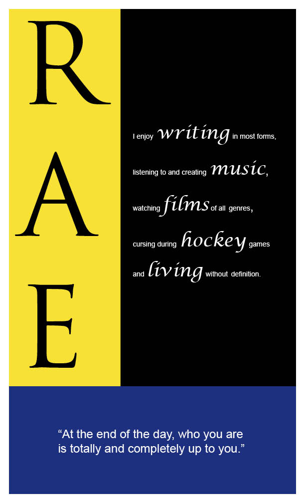
Considering that we couldn't incorporate anything besides text or color, I decided that I wanted the colors to represent my personality, but also correspond with one another. The blue is something that I wanted to represent the peace and calmness I like to have in my life, but I wanted it to be a deeper shade of blue to reflect that I am an intense individual and am quite melancholy at times. The yellow, being my favorite color and even the color of my room, is meant to represent that I strive to be happy and bring joy into other people's lives through humor and what not. And the use of black and white were to bring a sense of simplicity to the piece.
As for the fonts, I wanted to use three different fonts because I am not one to stick to a single thing. My favorite of all fonts is script because I'm a big fan of writing. I find it to be the most natural handwriting for me.
As for the words that I used, the obvious being my initials, a mini paragraph highlighting the things that make me, me, and a quote that I try to live by. I wanted to bring certain words/phrases to the forefront, which is why I selected the words: writing, music, films, hockey and living, to be featured in a larger script font.
After the critique, I was happy with the overall feedback and outcome and did take into consideration that if I had the opportunity, I would have aligned the R, A, E much more.
It was a good first project and I'm glad I had the opportunity to do it! If anyone has any addition feedback, please leave a comment. :)
Thursday, September 6, 2012
Watching Helvetica
For the last half of class on Wednesday, we began watching "Helvetica". Since I was signed up for this class last semester, I had already seen most of the film. However, I took more notes this time around and found some interesting things that I had overlooked originally.
Interesting facts about the typeface, Helvetica:
1. It emerged in 1957, when there was a need/want for a new modern and classic type face.
2. The font was created by Max Miedinger, who worked as font salesman.
3. Helvetica means "the Swiss" type face in Latin.
Helvetica is the chosen font for a number of well known businesses around the globe, including American Airlines, the NYC subway system, Jeep, BMW, Target, Verizon and The North Face.
One characteristic of Helvetica that was mentioned in the film was the use of horizontal letter slicing. For example the way to lowercase "e" is cut so cleanly.
Although I'm not as enthusiastic when it comes to fonts as the individuals highlighted in the film, I do understand the importance of font selection. Typefaces have the ability to give your words a mood, emotion and feeling. They can make a company look more professional and clean cut, or give something a slight edge.
P.S. If you didn't notice, I specifically used Helvetica has my font for this blog post!
Tuesday, August 28, 2012
Why is it important for Communication majors to study design?
I personally believe that it is necessary for all Communications majors to understand the art of design because it is a fundamental part of our society. As Communications majors we are involved with a variety of media forms, most of which, have a design element integrated into their organization and/or company. Graphic art is used to create logos, company headers and ascetically pleasing images in general.
Why does good design matter?
Good design can very often be the difference between a company or organization exceling within their line of work. By having a unique, easily recognizable or interesting logo, a company can become more well known and the design can even encourage people to see the company in a certain light. Whether the design is professional looking or more art-oriented, the viewer can get a certain feel even before learning about the company or organization's product or mission.
Favorite piece of design?
About two years ago a friend and I decided to rent a couple of snowboards and try it out. As we continued practicing and spending countless hours in the cold, we became engrossed in the sport. Having always watched the Winter X Games, I started to take more notice to the designs on the boards that professional boarders were using. A certain brand of boards has become my favorite, not only due to the quality of the board, but also because of the design itself.
Below is a picture of some of the boards that Never Summer has created. The first thing that drew me to these boards was the eagle encased in the circle logo and how it is also included in every design. The design in a way symbolizes the way a rider feels weightless and as though they are flying when riding. In my opinion, it is also a very strong logo that gives the board sustenance.

Impression following first class?
Following the first class, I was slightly overwhelmed, but I'm also hopeful. The information and skills that we will gain from taking this class are priceless when it comes to the field we are looking to build careers in. I look forward to acquiring knowledge related to using design software and creating our own work.
I personally believe that it is necessary for all Communications majors to understand the art of design because it is a fundamental part of our society. As Communications majors we are involved with a variety of media forms, most of which, have a design element integrated into their organization and/or company. Graphic art is used to create logos, company headers and ascetically pleasing images in general.
Why does good design matter?
Good design can very often be the difference between a company or organization exceling within their line of work. By having a unique, easily recognizable or interesting logo, a company can become more well known and the design can even encourage people to see the company in a certain light. Whether the design is professional looking or more art-oriented, the viewer can get a certain feel even before learning about the company or organization's product or mission.
Favorite piece of design?
About two years ago a friend and I decided to rent a couple of snowboards and try it out. As we continued practicing and spending countless hours in the cold, we became engrossed in the sport. Having always watched the Winter X Games, I started to take more notice to the designs on the boards that professional boarders were using. A certain brand of boards has become my favorite, not only due to the quality of the board, but also because of the design itself.
Below is a picture of some of the boards that Never Summer has created. The first thing that drew me to these boards was the eagle encased in the circle logo and how it is also included in every design. The design in a way symbolizes the way a rider feels weightless and as though they are flying when riding. In my opinion, it is also a very strong logo that gives the board sustenance.
Impression following first class?
Following the first class, I was slightly overwhelmed, but I'm also hopeful. The information and skills that we will gain from taking this class are priceless when it comes to the field we are looking to build careers in. I look forward to acquiring knowledge related to using design software and creating our own work.
Subscribe to:
Comments (Atom)