Before I get into any details, here is the final product:
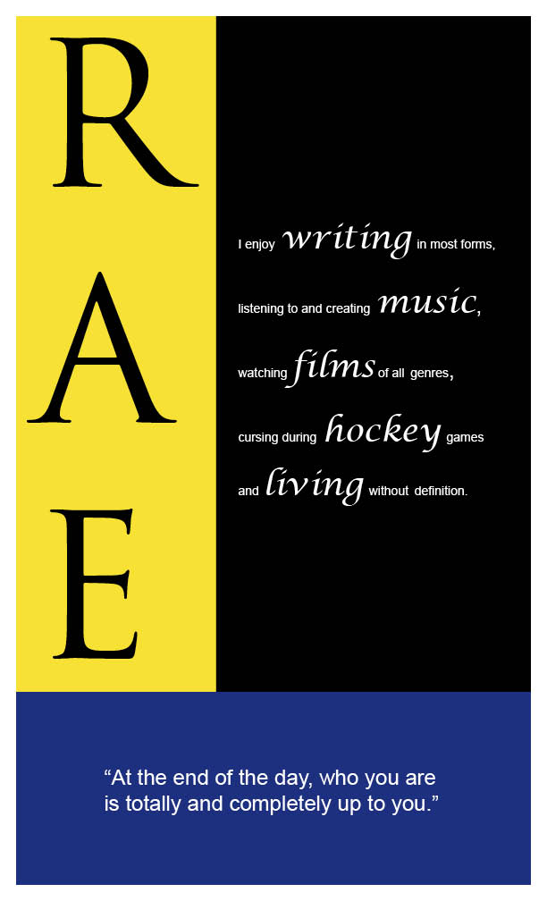
Considering that we couldn't incorporate anything besides text or color, I decided that I wanted the colors to represent my personality, but also correspond with one another. The blue is something that I wanted to represent the peace and calmness I like to have in my life, but I wanted it to be a deeper shade of blue to reflect that I am an intense individual and am quite melancholy at times. The yellow, being my favorite color and even the color of my room, is meant to represent that I strive to be happy and bring joy into other people's lives through humor and what not. And the use of black and white were to bring a sense of simplicity to the piece.
As for the fonts, I wanted to use three different fonts because I am not one to stick to a single thing. My favorite of all fonts is script because I'm a big fan of writing. I find it to be the most natural handwriting for me.
As for the words that I used, the obvious being my initials, a mini paragraph highlighting the things that make me, me, and a quote that I try to live by. I wanted to bring certain words/phrases to the forefront, which is why I selected the words: writing, music, films, hockey and living, to be featured in a larger script font.
After the critique, I was happy with the overall feedback and outcome and did take into consideration that if I had the opportunity, I would have aligned the R, A, E much more.
It was a good first project and I'm glad I had the opportunity to do it! If anyone has any addition feedback, please leave a comment. :)
Your initials projects came out really nicely, I like it a lot. What I really like is hearing the thought process behind the piece! I agree that the initials themselves need to be slightly more aligned but, like I said, I really think it turned out great. I like that it gets the message across in a simplistic form.
ReplyDelete