Ever since Professor Greenan introduced the class to project two, I've been mapping it out in my head. I almost immediately knew I wanted my book to revolve around losing my dad to cancer three years ago. Losing him was one of the hardest things I've ever gone through, but it also made me a better person. I experienced severe depression, which caused me to fall behind in school, ruin a few relationships, and even turn to self harm and an eating disorder. When I look back, it's almost as though I didn't even live for those few years, I merely existed.
It wasn't until March of this year that I actually felt like myself again and was able to discontinue using anti-depressants. As of now, I have a truly good quality life. I have become an even better version of myself and that's due in part to my dad and what he has inspired me to do and be.
The book will surround the idea that time isn't always on our side and we should never hesitate to say things like "I love you" to the people that mean the most to us. Today in class I began writing a poem that will act as the text of the book and I will start sketching out the images tonight or tomorrow.
Here's a quick sneak peak of the first stanza of the poem:
The world froze at 7:18.
The tick tock of the clock stopped,
Just as his breathing.
He was 59 the day that he died.
Thoughts?
Monday, October 22, 2012
Using FedEx to Print
I wanted to share my experience using FedEx Online Printing
to print my magazine layout for the in class presentations last week. A few
classmates faced some obstacles when it came to printing their final designs,
so I’m hoping this will give them a little guidance.
Once my project was completed and in PDF form, I accessed
the FedEx site and navigated to their online printing page, which can be found
here: http://www.fedex.com/us/office/index.html
I then clicked the “start online order” option and proceeded
with the “set up a document” option that allows you to upload files to the site
directly from your computer. Once uploaded, you can set the print options for
your document. I would recommend selecting the “set your own options,”
considering the fact that our projects need to be within a certain set of
guidelines. By setting your own options, you can select the type of paper,
print color and much more. The best part of this option is the fact that you
can add in special instructions that will be sent directly to the person
printing your document. When ordering my magazine layout, I made sure to
reiterate the fact that it was indeed an 11.5 x 17 document and I also wanted
it mounted onto a foam board.
Once you have done that, you can then entire in your
information and select which FedEx you would like to have your document sent
to. I selected the FedEx Kinko’s on McKinley Parkway in Blasdell, NY. If you did indeed include special
instructions, you will receive a phone call a few hours after placing your
order from a worker, who will go over your order before they finalize and print
it.
When I went to pick it up, the worker was extremely kind and
allowed me to look over the layout before I paid. In total, the layout cost me
around $8.
I hope this long and in-depth explanation will help some of
you the next time we have to print a project out for this class!
Best of luck!
Trouble With Exercises
I decided to dedicate this blog post to the exercises we have to complete on a weekly basis. I want to share my struggles with the assignments, but more so, I wanted to know how everyone else was fairing.
Throughout the first month of the semester, I was able to complete each exercise without much trouble. The instructions were clear and concise, and I was submitting each exercise early or on time. Once the October rolled around, I started to fall behind and find the tasks a bit more confusing and intense. I felt as though I had to designate entire class periods to work solely on exercises in order to stay on track. Today was actually going to be one of those days. Unfortunately, when I came into class, I found out that the online version of the textbook was out of service.
However, the news turned around in an instant when Professor Greenan announced that she wasn't too concerned with any of the leftover exercises and would rather us focus on our remaining projects. I can honestly say that relief washed over me and the word "HALLELUJAH" flashed in my mind, which instantly caused me to start singing that song to myself. I'm a music nerd, there's no denying it.
I'm beyond excited to work on the next project and am so very happy that I can pool all of my energy into one thing.
Everything will work out in the end, I suppose!
P.S. If you haven't heard Jeff Buckley's version of "Hallelujah," you definitely should give it a go. One of my top five favorite songs of all time. Check it out.
Wednesday, October 17, 2012
Project One: Magazine Layout
On Monday we presented our first graded project of the semester, the magazine layout. For my layout, I decided to work with "The Great Pumpkins" article because I am a massive fan of the fall season and I felt I could be fairly creative with this specific theme.
Being a fan of simplistic and modern design, I tried to create a layout that was innovative and yet somewhat traditional. I really enjoyed working with line and color, which you can see when you view my final project. Due to the theme of pumpkins, I consciously chose to use the colors; orange, black, white and a few neutral shades that were featured in the selected photographs.
As for the use of line, I originally had each column sectioned off, but with some guidance from Professor Greenan, I removed two of the thicker black lines to make the layout less structured.
The idea of layering a text box on-top of the two featured photographs came from one of the magazines that the Professor brought into class a few weeks back for us to skim through. I thought it gave the piece a more dimensional look and even allowed me to only use two images without it looking too simple.
For the font choices, I wanted to incorporate more than one typeface. The text is in Garamond, while the title is in Helvetica and the font size increases. I decided to do this to emphasis the title, considering it is indeed the "The Great Pumpkins."
Here is the final product:

Wednesday, September 26, 2012
Magazine Layout Inspiration
For the current project, I briefly flipped through the magazines provided by Professor Greenan. Along with those magazines, I decided to do some more research and look for a view inspiring layout ideas on the internet.
I found two that really stuck with me for very different reasons.
The first one was ironically an article about design!
 What I most admire about this layout is the simplicity. It isn't necessarily plain, but it isn't over the top. I feel as though the center image saves the layout from being too dull. I also admire the way the title, short description and a specific quote have been secluded. If I was creating this piece, I probably would've been self conscious over leaving that much white space, however, it works extremely well in my opinion.
The second one is an article about pumpkins! (I'm a huge fan of Halloween and fall, in general, so it seemed like a good fit.)
 The use of color and shape stood out most to me in this layout. I absolutely love the way the "p" is holding most of the text and the use of a mellow orange that mixes well with the white. Also, the line that runs along side the title down to the E is a great addition. It instantly draws the reader to a specified point.
For our in-class project, I decided to use the pumpkin article, so I'm hoping to incorporate something from each of these examples. I can't wait to share the final product in a few weeks! Wish me luck. :)
I found two that really stuck with me for very different reasons.
The first one was ironically an article about design!

The second one is an article about pumpkins! (I'm a huge fan of Halloween and fall, in general, so it seemed like a good fit.)

For our in-class project, I decided to use the pumpkin article, so I'm hoping to incorporate something from each of these examples. I can't wait to share the final product in a few weeks! Wish me luck. :)
Monday, September 17, 2012
Initials
For the initials project, I began envisioning what I wanted it to look like right after Professor Greenan displayed a few examples on the projector.
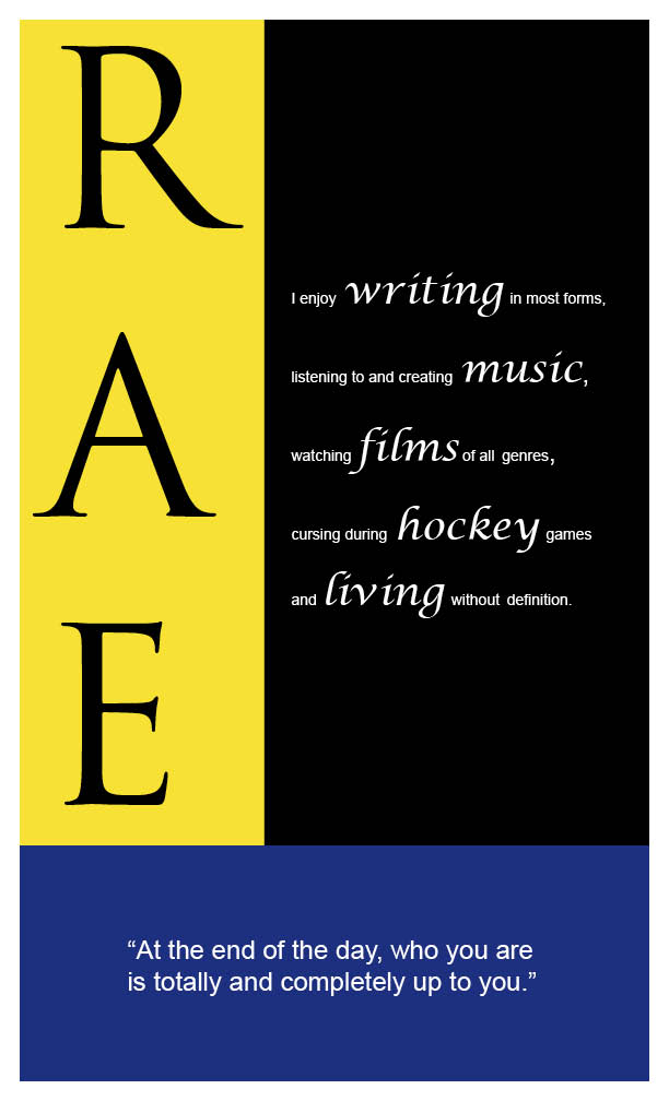
Before I get into any details, here is the final product:

Considering that we couldn't incorporate anything besides text or color, I decided that I wanted the colors to represent my personality, but also correspond with one another. The blue is something that I wanted to represent the peace and calmness I like to have in my life, but I wanted it to be a deeper shade of blue to reflect that I am an intense individual and am quite melancholy at times. The yellow, being my favorite color and even the color of my room, is meant to represent that I strive to be happy and bring joy into other people's lives through humor and what not. And the use of black and white were to bring a sense of simplicity to the piece.
As for the fonts, I wanted to use three different fonts because I am not one to stick to a single thing. My favorite of all fonts is script because I'm a big fan of writing. I find it to be the most natural handwriting for me.
As for the words that I used, the obvious being my initials, a mini paragraph highlighting the things that make me, me, and a quote that I try to live by. I wanted to bring certain words/phrases to the forefront, which is why I selected the words: writing, music, films, hockey and living, to be featured in a larger script font.
After the critique, I was happy with the overall feedback and outcome and did take into consideration that if I had the opportunity, I would have aligned the R, A, E much more.
It was a good first project and I'm glad I had the opportunity to do it! If anyone has any addition feedback, please leave a comment. :)
Before I get into any details, here is the final product:
Considering that we couldn't incorporate anything besides text or color, I decided that I wanted the colors to represent my personality, but also correspond with one another. The blue is something that I wanted to represent the peace and calmness I like to have in my life, but I wanted it to be a deeper shade of blue to reflect that I am an intense individual and am quite melancholy at times. The yellow, being my favorite color and even the color of my room, is meant to represent that I strive to be happy and bring joy into other people's lives through humor and what not. And the use of black and white were to bring a sense of simplicity to the piece.
As for the fonts, I wanted to use three different fonts because I am not one to stick to a single thing. My favorite of all fonts is script because I'm a big fan of writing. I find it to be the most natural handwriting for me.
As for the words that I used, the obvious being my initials, a mini paragraph highlighting the things that make me, me, and a quote that I try to live by. I wanted to bring certain words/phrases to the forefront, which is why I selected the words: writing, music, films, hockey and living, to be featured in a larger script font.
After the critique, I was happy with the overall feedback and outcome and did take into consideration that if I had the opportunity, I would have aligned the R, A, E much more.
It was a good first project and I'm glad I had the opportunity to do it! If anyone has any addition feedback, please leave a comment. :)
Thursday, September 6, 2012
Watching Helvetica
For the last half of class on Wednesday, we began watching "Helvetica". Since I was signed up for this class last semester, I had already seen most of the film. However, I took more notes this time around and found some interesting things that I had overlooked originally.
Interesting facts about the typeface, Helvetica:
1. It emerged in 1957, when there was a need/want for a new modern and classic type face.
2. The font was created by Max Miedinger, who worked as font salesman.
3. Helvetica means "the Swiss" type face in Latin.
Helvetica is the chosen font for a number of well known businesses around the globe, including American Airlines, the NYC subway system, Jeep, BMW, Target, Verizon and The North Face.
One characteristic of Helvetica that was mentioned in the film was the use of horizontal letter slicing. For example the way to lowercase "e" is cut so cleanly.
Although I'm not as enthusiastic when it comes to fonts as the individuals highlighted in the film, I do understand the importance of font selection. Typefaces have the ability to give your words a mood, emotion and feeling. They can make a company look more professional and clean cut, or give something a slight edge.
P.S. If you didn't notice, I specifically used Helvetica has my font for this blog post!
Subscribe to:
Posts (Atom)