This past Thursday, I went to see Breaking Dawn: Part 2 with a group of friends. Yes, it's possibly one of the worst teen book series, but it's a guilty please of mine. As the film started, I realized just how much my perspective and senses have been effected since taking this course. I was immediately mesmerized by the opening titles and the design. Unfortunately, I don't have any images to share since the film just premiered this weekend, but I can honestly say it was pretty fantastic. As they displayed each actor's name, the screen flipped between three color filters, red, black, and white. The images they were layered over were of snow-covered mountains, deep valleys, and rivers. Something so simple was already giving me chills!
After experiencing that excitement, I decided to share a few other designs that stem from album cover art to again, opening film credits.
First up is British singer/songwriter Ed Sheeran and the cover art for his most recent album, "+".
It is a very simple concept. Ed's face. Ed's name. A plus symbol. And a paw-print. Each of these things reflect that artist. All of these details may seem minor, but they are now the basis for anything that Ed releases or designs. Ed, who is a ginger, has always been very enthusiastic about the color orange and paw-prints. The font has become his "go-to" font for clothing, tour buses, stage backdrops, and so on. I think I enjoy this album cover so much because it embodies everything that is Ed Sheeran without the actual music.
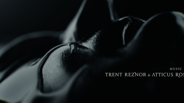
Second up is the opening credits for the 2011 film, The Girl With The Dragon Tattoo.
I read the series prior to seeing the film, so I was absolutely pumped to see the film! If any of you have read the books, you know that they are all fairly dark and twisted. The opening titles reflect the books by using footage/images of people cover in a black liquid with a black backdrop and a simple light filtering through. As you can see in the picture above, they selected a font that adds to the creepy and eerie feeling that surrounds the movie.
Just a few things that I wanted to share with all of you! Any album covers or film designs that you admire?
Sunday, November 18, 2012
Monday, November 12, 2012
Poster Ideas
For our next class project, we have been asked to create a poster that addresses a social/humanistic problem that means something to us. I was instantly excited for this project because I've always loved showing support and bringing attention to issues that truly resonate with me. Unfortunately, I'm currently struggling with deciding between two separate ideas.
Since the election just ended a week ago, I'm still buzzing from everything that has been described as a "hot topic" over the past five or six months. I'm very open with the fact that I am indeed in support of women's' rights and gay rights. Being a woman, I feel that we are all individuals and should have control over our bodies, whether it be the right to have an abortion, not to have an abortion, receive contraception through our work's insurance, or define the different "levels" of rape, it is our right. As for gay rights, I've always believed wholeheartedly that everyone should have the same rights no matter who you're in love with. Love is love. One of my coworkers is openly gay and I can not image missing his wedding solely because the state tells him his marriage shouldn't count.
So, now that my rant is over, I'm between the possibilities of having a poster that reads "My Body. My Choice." for women or even being a bit more rash and saying "My Uterus. My Choice." or a poster supporting gay rights that reads, "Love Is Equal."
Does anyone have any suggestions?
And just to make sure I'm not offending anyone, I want to say that I respect all of your opinions in regards to these subjects. These are my opinions, I am not forcing them on any of you. Please understand that.
Since the election just ended a week ago, I'm still buzzing from everything that has been described as a "hot topic" over the past five or six months. I'm very open with the fact that I am indeed in support of women's' rights and gay rights. Being a woman, I feel that we are all individuals and should have control over our bodies, whether it be the right to have an abortion, not to have an abortion, receive contraception through our work's insurance, or define the different "levels" of rape, it is our right. As for gay rights, I've always believed wholeheartedly that everyone should have the same rights no matter who you're in love with. Love is love. One of my coworkers is openly gay and I can not image missing his wedding solely because the state tells him his marriage shouldn't count.
So, now that my rant is over, I'm between the possibilities of having a poster that reads "My Body. My Choice." for women or even being a bit more rash and saying "My Uterus. My Choice." or a poster supporting gay rights that reads, "Love Is Equal."
Does anyone have any suggestions?
And just to make sure I'm not offending anyone, I want to say that I respect all of your opinions in regards to these subjects. These are my opinions, I am not forcing them on any of you. Please understand that.
Completed: Instant Book
Last Wednesday was our critique for the instant book project. As I previously wrote in another post, my book was pretty personal, so I was a bit nervous about sharing it with the class. I've always loved expressing myself through poems, song lyrics, and writing in general, so I was excited for the class to read one of my little poems. I was definitely pleased with my final project because I felt as though the images I incorporated brought the poem to life.
Professor Greenan mentioned the fact that images almost took us away to Paris and made it seem as though this story was happening elsewhere. She also commented on the fact that I wrote the story in third person. To be honest, it happened quite subconsciously and as I look back, I think I wanted to tell the story as though everything that I was talking about had happened to another girl and not necessarily to me. One of the main themes of the book was also the importance of numbers. I know for a fact that I will never forget the time that my Dad passed, his age, my age at the time, or the date. Those numbers are burned in my brain and I think that by emphasizing them, I was able to make the readers realize just how much losing someone can impact your existence.
Here's how my book turned out:
*There is spelling mistake (clock), but I did correct this before the final printing.
Here's the inside poster:
Professor Greenan mentioned the fact that images almost took us away to Paris and made it seem as though this story was happening elsewhere. She also commented on the fact that I wrote the story in third person. To be honest, it happened quite subconsciously and as I look back, I think I wanted to tell the story as though everything that I was talking about had happened to another girl and not necessarily to me. One of the main themes of the book was also the importance of numbers. I know for a fact that I will never forget the time that my Dad passed, his age, my age at the time, or the date. Those numbers are burned in my brain and I think that by emphasizing them, I was able to make the readers realize just how much losing someone can impact your existence.
Here's how my book turned out:
*There is spelling mistake (clock), but I did correct this before the final printing.
Here's the inside poster:
I wanted the font that I used to tell the story/poem to look handwritten and give the reader the sense that they were maybe even reading a personal letter or journal. Everything from the photographs to the text is original, except for the final quote on the inside poster. I wanted to include that specific quote because it describes my Dad and the fact that he never told me what to do with my life or how to carry myself, he merely set an example and I learned from that.
Any thoughts or comments are more than welcome! Thanks for checking this out. :)
I would also like to dedicate this post to my Dad. Thank you for being such an amazing person and teaching me to love who I am and never give up on any dream no matter how massive it may seem. You were the best and I hope to make you proud. I love you, dearly.
Monday, November 5, 2012
Importance of Color
I'm noticing more so now with the election right around the corner, that news shows feel very strongly about the colors they use to design their sets and graphics.
I'm currently watching the Rachel Maddow Show on MSNBC, which airs at 9pm ET, and is a political opinion/current news program. I usually tend to watch CNN, but over the last few months I discovered Maddow and really got hooked on her interviews and commentary. Until now, I hadn't realized just how american pride her set and graphics were!
The studio is adorned in all red, white, and blue. The graphics that appear when the show turns to a commercial are red, white, and blue. The headline designs, the poll graphics, the news ticker, and even the cup on her desk, are all RED, WHITE, and BLUE.
Coincidence? I'm thinking not.
Rachel Maddow, whom I would consider to be a liberal individual, is pretty aware of the importance of displaying the fact that her program is meant to bring serious and vital information to the American public. No matter her political positions, we automatically associate the program with the country and the governmental aspect. Who knows if Rachel is even that massively proud of being an American, but her program's design seems to speak volumes. Could the point of all the american pride color schemes be to attract "channel flippers," who might otherwise mistaken the program as something more boring and lackluster?
Here's a promotional graphic for The Rachel Maddow Show.
I'm currently watching the Rachel Maddow Show on MSNBC, which airs at 9pm ET, and is a political opinion/current news program. I usually tend to watch CNN, but over the last few months I discovered Maddow and really got hooked on her interviews and commentary. Until now, I hadn't realized just how american pride her set and graphics were!
The studio is adorned in all red, white, and blue. The graphics that appear when the show turns to a commercial are red, white, and blue. The headline designs, the poll graphics, the news ticker, and even the cup on her desk, are all RED, WHITE, and BLUE.
Coincidence? I'm thinking not.
Rachel Maddow, whom I would consider to be a liberal individual, is pretty aware of the importance of displaying the fact that her program is meant to bring serious and vital information to the American public. No matter her political positions, we automatically associate the program with the country and the governmental aspect. Who knows if Rachel is even that massively proud of being an American, but her program's design seems to speak volumes. Could the point of all the american pride color schemes be to attract "channel flippers," who might otherwise mistaken the program as something more boring and lackluster?
Here's a promotional graphic for The Rachel Maddow Show.
Thoughts?
Instant Book Update!
Today I officially completely my instant book. It differs in a few ways from the draft I created last week, but I'm pleased with those changes that came along as I designed it. Instead of including hand drawings, I opted to select some photographs I took recently and not so recently.
Two of the pictures I included are images I captured on my trip to Europe back in the summer of 2010. I went overseas for two weeks and spent time in London, Paris and Rome. Needless to say, it was amazing and I would love to go back in the future. Who knows, maybe even live there for some time.
Anyway, the pictures gave the book a more "dressed up" feel, in my opinion, but with the fonts I selected, you can still tell that the book is meant to be personal. I honestly love that we had to do this in gray scale. It challenged me at times. At one point I was designing the cover and thought that only using black, white, and RED, would be a great look for my book, unfortunately, red is not black or white. Whoops.
I'm honestly a bit nervous about the critique on this project because I took a few chances and decided to be slightly less conservative with my design, but I'm truly happy with it. Fingers crossed that it's well received!
I'll be photocopying the final product tomorrow, then spending some time folding for Wednesday!
Look for my final product sometime on Wednesday or Thursday evening. Can't wait for everyone to see it!
Two of the pictures I included are images I captured on my trip to Europe back in the summer of 2010. I went overseas for two weeks and spent time in London, Paris and Rome. Needless to say, it was amazing and I would love to go back in the future. Who knows, maybe even live there for some time.
Anyway, the pictures gave the book a more "dressed up" feel, in my opinion, but with the fonts I selected, you can still tell that the book is meant to be personal. I honestly love that we had to do this in gray scale. It challenged me at times. At one point I was designing the cover and thought that only using black, white, and RED, would be a great look for my book, unfortunately, red is not black or white. Whoops.
I'm honestly a bit nervous about the critique on this project because I took a few chances and decided to be slightly less conservative with my design, but I'm truly happy with it. Fingers crossed that it's well received!
I'll be photocopying the final product tomorrow, then spending some time folding for Wednesday!
Look for my final product sometime on Wednesday or Thursday evening. Can't wait for everyone to see it!
Monday, October 22, 2012
Book Theme
Ever since Professor Greenan introduced the class to project two, I've been mapping it out in my head. I almost immediately knew I wanted my book to revolve around losing my dad to cancer three years ago. Losing him was one of the hardest things I've ever gone through, but it also made me a better person. I experienced severe depression, which caused me to fall behind in school, ruin a few relationships, and even turn to self harm and an eating disorder. When I look back, it's almost as though I didn't even live for those few years, I merely existed.
It wasn't until March of this year that I actually felt like myself again and was able to discontinue using anti-depressants. As of now, I have a truly good quality life. I have become an even better version of myself and that's due in part to my dad and what he has inspired me to do and be.
The book will surround the idea that time isn't always on our side and we should never hesitate to say things like "I love you" to the people that mean the most to us. Today in class I began writing a poem that will act as the text of the book and I will start sketching out the images tonight or tomorrow.
Here's a quick sneak peak of the first stanza of the poem:
The world froze at 7:18.
The tick tock of the clock stopped,
Just as his breathing.
He was 59 the day that he died.
Thoughts?
It wasn't until March of this year that I actually felt like myself again and was able to discontinue using anti-depressants. As of now, I have a truly good quality life. I have become an even better version of myself and that's due in part to my dad and what he has inspired me to do and be.
The book will surround the idea that time isn't always on our side and we should never hesitate to say things like "I love you" to the people that mean the most to us. Today in class I began writing a poem that will act as the text of the book and I will start sketching out the images tonight or tomorrow.
Here's a quick sneak peak of the first stanza of the poem:
The world froze at 7:18.
The tick tock of the clock stopped,
Just as his breathing.
He was 59 the day that he died.
Thoughts?
Using FedEx to Print
I wanted to share my experience using FedEx Online Printing
to print my magazine layout for the in class presentations last week. A few
classmates faced some obstacles when it came to printing their final designs,
so I’m hoping this will give them a little guidance.
Once my project was completed and in PDF form, I accessed
the FedEx site and navigated to their online printing page, which can be found
here: http://www.fedex.com/us/office/index.html
I then clicked the “start online order” option and proceeded
with the “set up a document” option that allows you to upload files to the site
directly from your computer. Once uploaded, you can set the print options for
your document. I would recommend selecting the “set your own options,”
considering the fact that our projects need to be within a certain set of
guidelines. By setting your own options, you can select the type of paper,
print color and much more. The best part of this option is the fact that you
can add in special instructions that will be sent directly to the person
printing your document. When ordering my magazine layout, I made sure to
reiterate the fact that it was indeed an 11.5 x 17 document and I also wanted
it mounted onto a foam board.
Once you have done that, you can then entire in your
information and select which FedEx you would like to have your document sent
to. I selected the FedEx Kinko’s on McKinley Parkway in Blasdell, NY. If you did indeed include special
instructions, you will receive a phone call a few hours after placing your
order from a worker, who will go over your order before they finalize and print
it.
When I went to pick it up, the worker was extremely kind and
allowed me to look over the layout before I paid. In total, the layout cost me
around $8.
I hope this long and in-depth explanation will help some of
you the next time we have to print a project out for this class!
Best of luck!
Subscribe to:
Posts (Atom)