Wednesday, December 12, 2012

Brochure Critique

Our final day of class was this past Monday, where we spent some time passing around each of our completed brochures. I honestly can't say that there was one I didn't like or find creative. I was extremely pleased with the response that my brochure received. People mentioned that it seemed professional and well balanced, while Professor Green commented on my ability to select fonts that mesh well. I was genuinely happy with the response because this piece was a bit more fun for me to work on, rather than the heavily emotional project I've done most of the semester.

As mentioned in a previous post, my brochure's purpose was to promote and educate everyone on one of my favorite musicians, Ed Sheeran. The color scheme I used was a mixture of orange, black, and white. I was apprehensive about using orange as a main color, but I felt it was necessary since Ed is indeed a ginger and uses the color quite often!

SIDE ONE:
SIDE TWO:
I wanted each page to serve a specific purpose and have it's own identity, but without straying too far that it seemed completely random and out of place. Also, for picture selection, the three images that I chose to use helped give the page more if it's identity. For instance, on the biography page, we have a more quirky photograph of Ed. The tour page features an image of him performing. And the social media page has a picture of him with a piece of paper saying "HI!" on his tongue.

If anyone is wondering why there is an orange paw-print on the front page, it's because Ed has made that paw-print on of his signature logos, along with a plus sign. Staying on the topic of the front page, I didn't include any images because I wanted to emphasis the fact that Ed Sheeran is a very music first artist. He is actually quite awkward in interviews and would much rather let his music do the talking.

I would love to get some more feedback on my brochure! Some of my friends suggested that I actually mail the brochure to Ed's management team! Haha :)


Tuesday, December 4, 2012

Nikolay Saveliev

I'm dedicating this blog post to an up-and-coming graphic design artist, Nikolay Saveliev, whom I discovered while reading Print Magazine's 20 Best Graph Artists Under 30. Saveliev, who is originally from St. Petersburg, Russia, studied at the Rhode Island School of Design. While still studying, Saveliev left for NYC, where he tried his hand at go-go dancing. After realizing that it wasn't one of his best decisions, he returned to school to complete his degree before trying the NYC scene one more time. 

Through the variety of branding jobs he worked, Nikolay developed his own style of illustrations where he could create his own worlds. Eventually, he gained attention through his designs via freelance and personal projects. Saveliev says that he is influenced by 80's New Wave Music and even religion, even though he isn't particularly religious from a personal standpoint.

"I like the higher-up mysticism," he says, "which is a lot like design, a lot like art--it's trying to communicate something that's not tangible until you create it." (credit to printmag.com) 

Here's one of Saveliev's featured works on printmag.com:


Brochure Options

For our final project, we have been asked to design a tri-fold brochure that can focused on practically anything we so choose! When I first approached the project, I was torn between doing a brochure on the lovely city of London, or a brochure about myself to be used as a resume piece. As I debated between the two ideas, I was listening to one of my favorite artists, Ed Sheeran, a fairly unknown British singer songwriter. It was then that I decided I wanted to dedicate the brochure to him!

At that point, the music geek in me was pretty darn excited to work on a whole project that was devoted to a great musician. I figured that the brochure could include things such as a short biography, discography, upcoming tour dates, and so on!

As of right now, the brochure is looking good. I have two more pages to complete before I can call it a day. I tried my best to make the brochure truly reflect Ed through the symbols, images, and colors that I selected. For instance, Ed is known for his ginger hair, so he tends to emphasis that by using orange as a major color when it comes to his album cover, merchandise, and promotional material. So, it's safe to say that one of the three colors I'm incorporating into my brochure is indeed orange!

The biggest obstacle I've faced during the process has been finding a way to fit in all of the information without crowding the pages or cutting of any words. Luckily, with some sizing adjustments it's coming together.

Can't wait for it to be completed! Only two more classes left, then we're done for the semester. CRAZY.

Mental Illness Awareness Poster

As I mentioned in my previous post, I created two social awareness posters because I was having difficulty deciding between my two ideas. For the poster that I selected to submit for grading and critique, I focused on the awareness of mental illnesses. 

Approximately a month before my dad passed away from cancer, I was professionally diagnosed with severe depression. Throughout the next three to four years I struggled with daily tasks because I had very little want to do much besides hide in bed and listen to music. It got to the point that my part-time job was suffering because I would call in more than half the time and I had to withdrawal from multiple courses during multiple semesters. During these struggles, I was supported by amazing and loving people, however, I did encounter a few individuals who felt my depression was something I could fix with positive thinking or maybe even the flick of a switch. It wasn't until last summer that I was able to come off of anti-depressants, and yet I still have moments where I find myself stuck in similar place as before. 

Here's my poster:


For my slogan/tag line, I wanted to use something that was direct and firm, without being rude. I feel that "IT'S REAL. Even if you can't see it." describes precisely the message I wanted to get across. Although mental illnesses can't be seen from the outside, they are very serious in nature and do have a profound effect on a person's well-being.  I used two different fonts, one that was serif and one the was helvetica light. As for the color scheme, I consciously choose to use blue because it is so commonly associated with sadness, melancholy, and depression. 

Feedback and comments are welcome :)

Saturday, November 24, 2012

Women's Rights

As I mentioned previously, I was considering creating a poster based on the need for people to acknowledge women's rights. Well, I ended up creating two posters! One for mental illness awareness, AND one for women's rights. Since we can technically only bring one to the critique, I decided to just share the women's rights poster on here. 

Firstly, how ironic that Professor Greenan posted a blog about a local movie reviewer who lost his job because his publisher didn't agree with his support (reviewing) of films that displayed women as strong and independent individuals.

Here's a quick excerpt from the article she linked us to:


I found this extremely disgusting and upsetting. The fact that a grown man feels that manhood is being threatened by the way women are being portrayed in films is almost laughable. However, instead of using this  blog entry to rant, I'll let my poster design do the talking for me.

Here's my poster:


I wanted the message to be direct and show just how important and powerful a woman is in this world. The woman's silhouette was what I had envisioned from the beginning. The idea of having a strong female taking up most of the poster helped the message take on a life of its own, in my opinion. As for the text, I wanted it to be simple, but bold and firm. "MY BODY. MY CHOICE." Says it all really! I needed the color scheme to have a bold color, so I figured a deep crimson was a good fit. I honestly feel that colors like red, black, and white have the ability to be clean, yet give a piece some emotion.

I'll be sharing my second poster later this week! Thanks for reading and checking out my blog. :) Any thoughts or comments are welcome, as usual.

Sunday, November 18, 2012

Album Cover Art and Film Credits

This past Thursday, I went to see Breaking Dawn: Part 2 with a group of friends. Yes, it's possibly one of the worst teen book series, but it's a guilty please of mine. As the film started, I realized just how much my perspective and senses have been effected since taking this course. I was immediately mesmerized by the opening titles and the design. Unfortunately, I don't have any images to share since the film just premiered this weekend, but I can honestly say it was pretty fantastic. As they displayed each actor's name, the screen flipped between three color filters, red, black, and white. The images they were layered over were of snow-covered mountains, deep valleys, and rivers. Something so simple was already giving me chills!

After experiencing that excitement, I decided to share a few other designs that stem from album cover art to again, opening film credits.

First up is British singer/songwriter Ed Sheeran and the cover art for his most recent album, "+".

It is a very simple concept. Ed's face. Ed's name. A plus symbol. And a paw-print. Each of these things reflect that artist. All of these details may seem minor, but they are now the basis for anything that Ed releases or designs. Ed, who is a ginger, has always been very enthusiastic about the color orange and paw-prints. The font has become his "go-to" font for clothing, tour buses, stage backdrops, and so on. I think I enjoy this album cover so much because it embodies everything that is Ed Sheeran without the actual music.

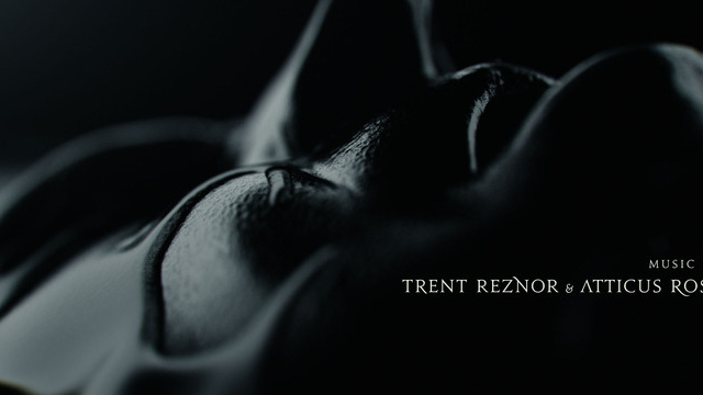
Second up is the opening credits for the 2011 film, The Girl With The Dragon Tattoo.

I read the series prior to seeing the film, so I was absolutely pumped to see the film! If any of you have read the books, you know that they are all fairly dark and twisted. The opening titles reflect the books by using footage/images of people cover in a black liquid with a black backdrop and a simple light filtering through. As you can see in the picture above, they selected a font that adds to the creepy and eerie feeling that surrounds the movie.

Just a few things that I wanted to share with all of you! Any album covers or film designs that you admire?


Monday, November 12, 2012

Poster Ideas

For our next class project, we have been asked to create a poster that addresses a social/humanistic problem that means something to us. I was instantly excited for this project because I've always loved showing support and bringing attention to issues that truly resonate with me. Unfortunately, I'm currently struggling with deciding between two separate ideas.

Since the election just ended a week ago, I'm still buzzing from everything that has been described as a "hot topic" over the past five or six months. I'm very open with the fact that I am indeed in support of women's' rights and gay rights. Being a woman, I feel that we are all individuals and should have control over our bodies, whether it be the right to have an abortion, not to have an abortion, receive contraception through our work's insurance, or define the different "levels" of rape, it is our right. As for gay rights, I've always believed wholeheartedly that everyone should have the same rights no matter who you're in love with. Love is love. One of my coworkers is openly gay and I can not image missing his wedding solely because the state tells him his marriage shouldn't count.

So, now that my rant is over, I'm between the possibilities of having a poster that reads "My Body. My Choice." for women or even being a bit more rash and saying "My Uterus. My Choice." or a poster supporting gay rights that reads, "Love Is Equal."

Does anyone have any suggestions?

And just to make sure I'm not offending anyone, I want to say that I respect all of your opinions in regards to these subjects. These are my opinions, I am not forcing them on any of you. Please understand that.